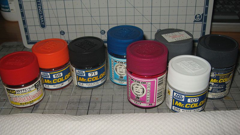
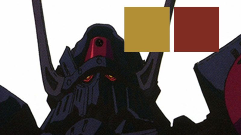
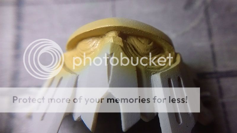
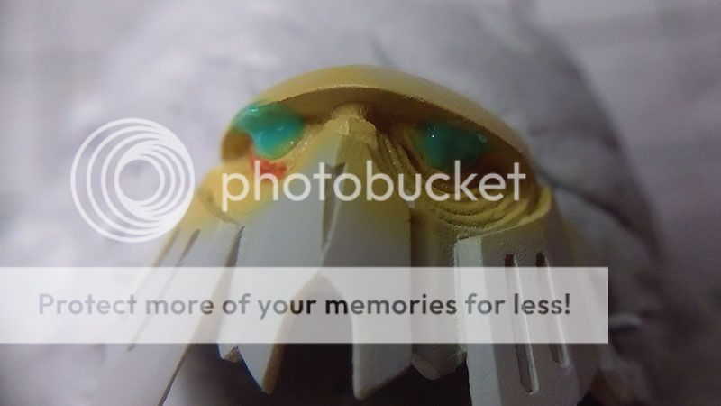
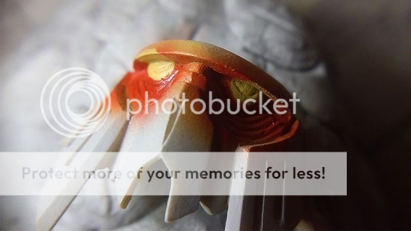
I used Tan color and Brown(Tea) color to mix with yellow for the eyes.
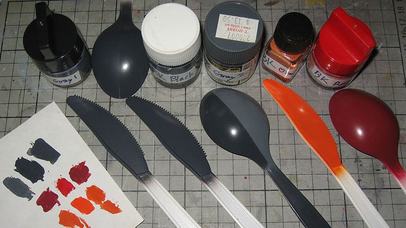
While I was at it, I thought about last time the orange turned green is probably the gray I used is a sort of blue color. I was given a tip about black color, that they always have cool or warm tone, when mixed with yellow it will immediately show.
I also tried to mix another bottle of orange, this time I mixed it with Tea color and a bit yellow.
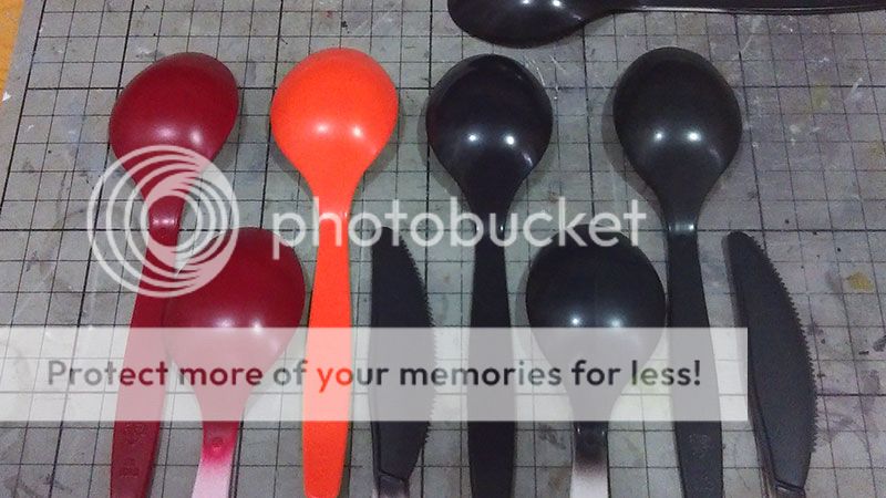
The new mix of orange is painted on both end of the spoon, it still looks sharp in this photo but in person it's been desaturated by quite a bit, no longer fluorescent looking. The middle is the first mixture, and I painted some 59 orange out of the bottle in those 2 rectangles in between.
The problem with the first mix, it is more yellow than it is desaturated, and it is very light, has too much contrast with the red and black.
Also still testing and observing the main black, I'm on the third bottle now, I had it, then I messed it up, by wearing a green t-shirt while doing it. After so many spoon painting, I also familiarize myself with the paint thickness, air pressure, paint flow using the PS290.
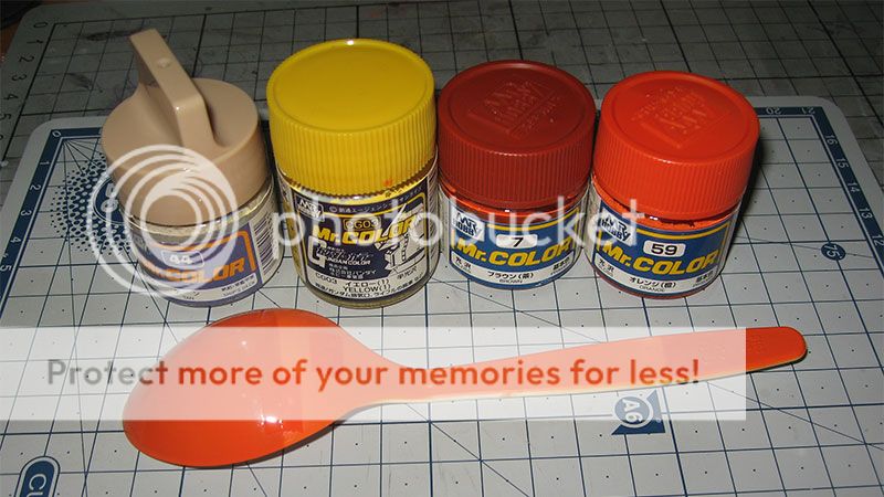 Contrast of first mixture of orange
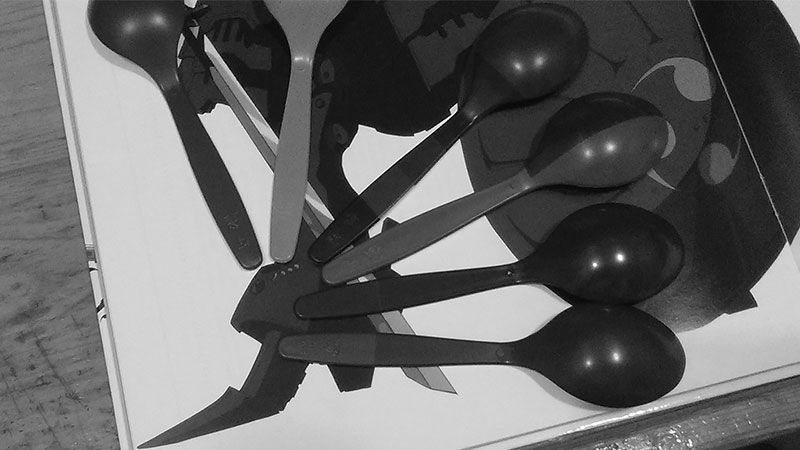
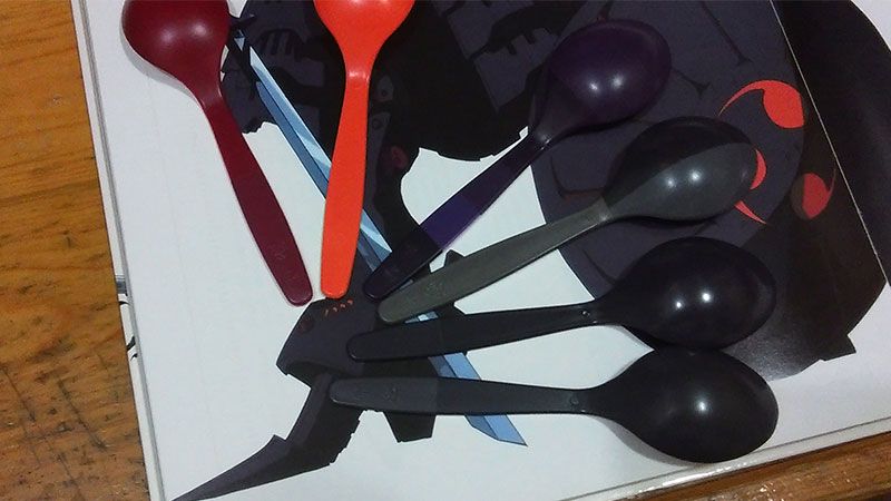
I can't work with the previous bottle of paint anymore as it now has too much tonal impurity in it. I mixed another bottle of main black, this time I begun with a mixture of 67 Purple and 80 Cobalt Blue to set the tone, then in a separate bottle I mixed them with gray. Now this color if placed against white background it will look too vibrant, but when I set it in the shelf behind the glass, on hand, or on photo it looks about right, similar to Wave and the line art. I'm still debating if I want to lighten it, now it doesn't seem to have harmony with the red and orange. I haven't tested it on a large round surface like it would be on the shield, on the arm parts and skirt it seem alright, but not sure about the legs, shoulders, shield.
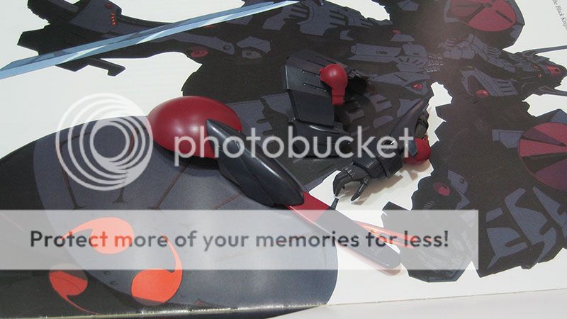
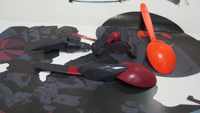
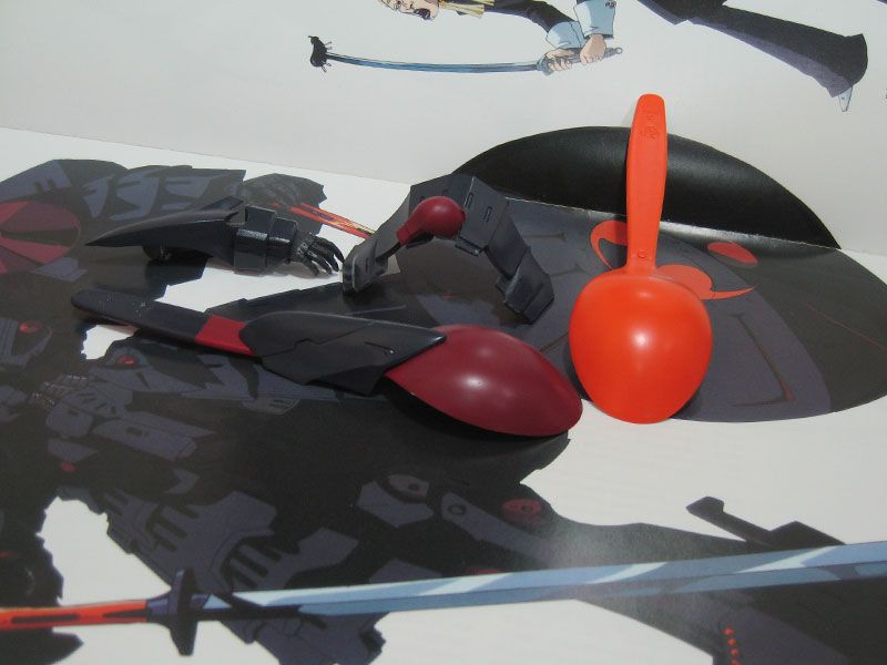
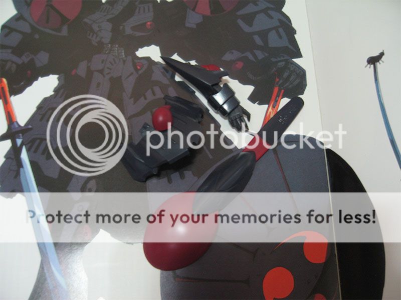
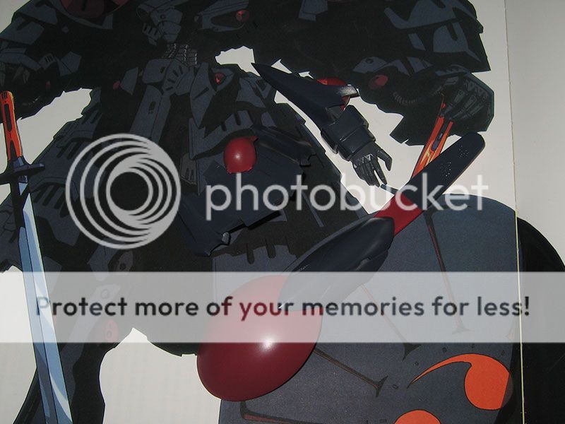
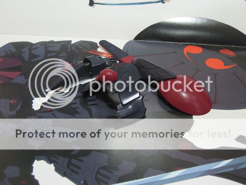
More testing, again in the morning, as I had doubt with almost all of the colors.
The black, looks too purple and black at the same time, I tested it on an optional armor part, I hated it, the surface details were so hidden under its semi-gloss finish, I added quite a bit of white to lighten it, it's only a bit lighter but the difference is quite huge. Yet under my room's lighting, you would still look at it and say it is a type of black. The amount of purple in it is now very subtle I guess, at a first glance it would appear just grey, after looking at it for a while the purple starts to show a little, maybe too little now?! I reckon it is better to have it subtle than overdone.
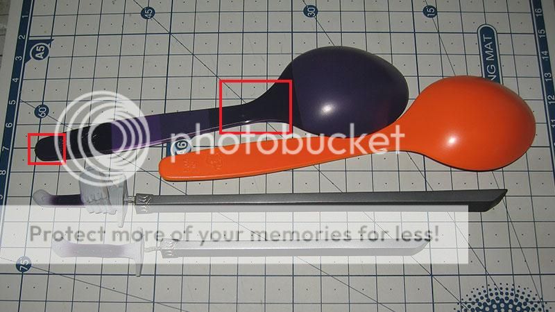
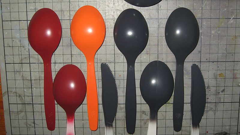
Clock-wise from the red, I masked off the spoons to paint only the tip, so you see the the difference with the old mixes.
The scan from the Designs 3 has a lot of contrast an brightness in it. I also referenced to the Knight Flags.
The red is more dark and desaturated, but since there are some highlight of red on the forehead and chest in the line art, I did some adjustment and this is the color I think it is supposed to be according to the image in my head.
I can't find a way to desaturate orange, it would turn green for some reason, so I only added a bit more Gundam Yellow.
Purple for the sword handle isn't changed.
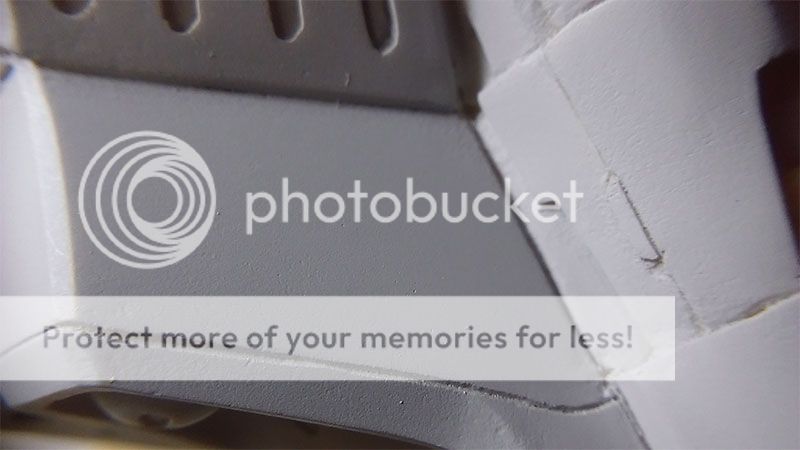
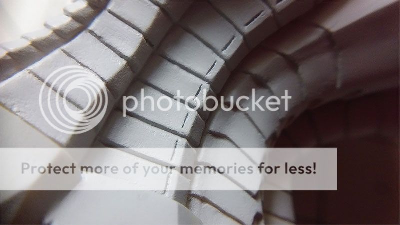
I added about 30% of brown to the light grey for the under armor, the patterns on the underside are rectangles so I thought a brown-ish gray would revok the padding under armors。
The color in the line art supposedly shown how it would look under sunlight, I used the lower part of the page for reference which is darker. My color is even a bit darker than that, and less blue。
The frame gray has been lighten by a lot, to have more contrast with the main color(my black is darker, and my frame is lighter compared to the drawing)。I hated how it had a little green and blue so I added just a bit of brown。
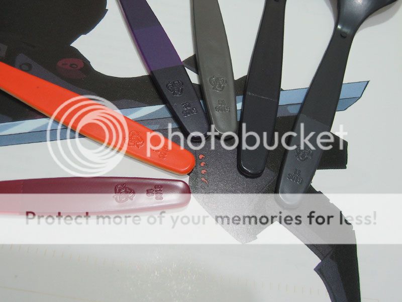
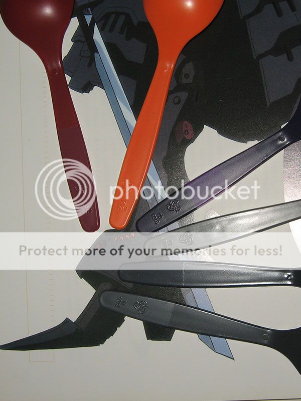
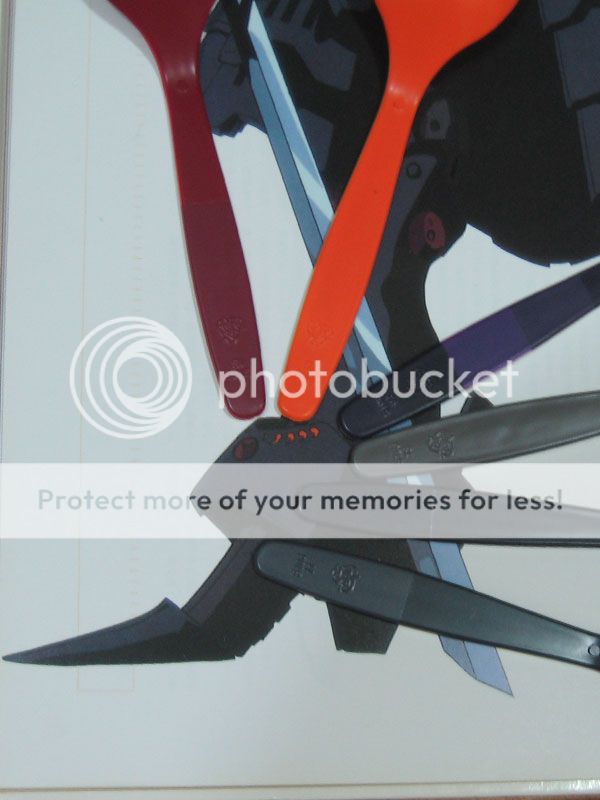
I tested it on the optional parts, I should prep these part as well, they will come in handy in the future builds. Now they looked ugly due to them being not sanded.
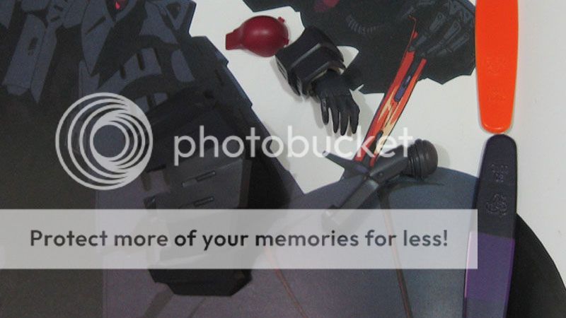
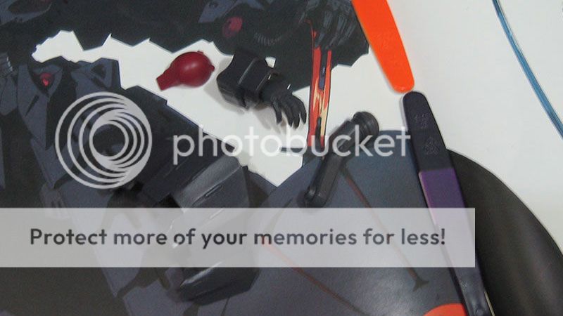
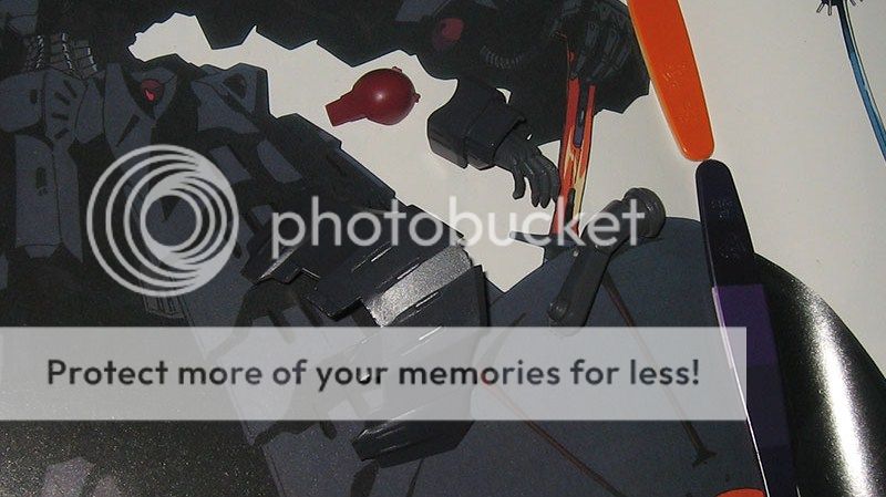
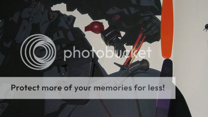
Woke up early this morning to make use of the sunlight.
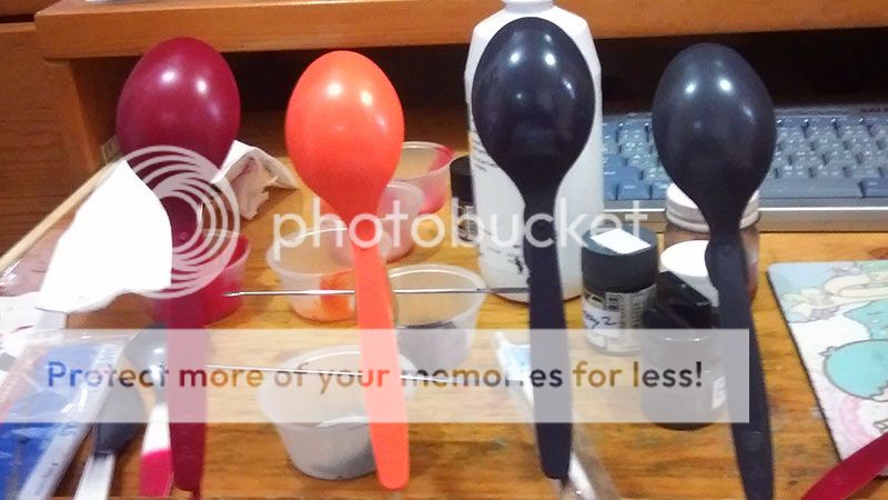
The upper roll is from today testing, lower roll is yesterdays. From left to right,
I found the red from yesterday is a bit dark, I added a bit magenta and red, the difference won't show on photo.
The orange I mixed yesterday by de saturating no.59 Orange was way too bright, for some reason the paint won't mix well, after a night some dark pigments are sunken to the bottom, I can't get the right mixture each time I open that bottle. I threw that one away. This time I started with Gundam Color Yellow and added no.59 a little at a time..
The black is made darker yet more purple, to create a bit more contrast with the frame, as I don't want to lighten up the frame gray color too much. Even so, the frame color is very similar to the main black in term of brightness.
The Orange in this photo looks way too sharp for some reasons, the last picture is more like it is in person. Like always with my camera the purple won't be captured.
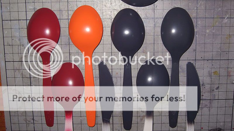 Flash light off with my phone. I wish my iPhone wasn't stolen.
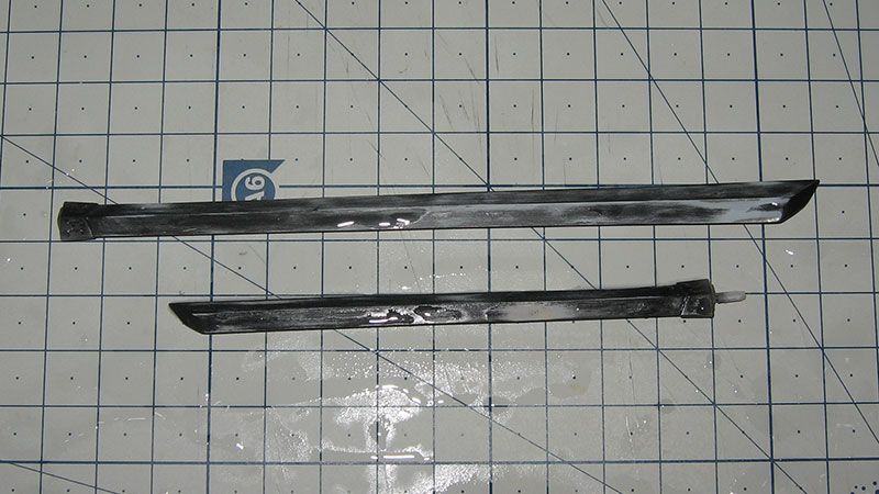
 I painted the blades gloss black and then Super Iron+black
I'm so afraid of dropping this metal part, it will for sure be disastrous, be done with it soon then seal it away!
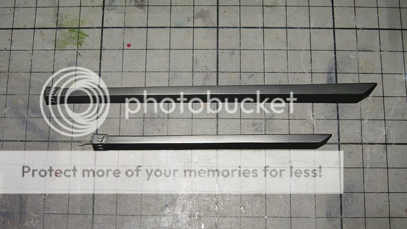
I painted the blades gloss black and then Super Iron+black
I'm so afraid of dropping this metal part, it will for sure be disastrous, be done with it soon then seal it away!
Noticed this from Wave's photo, the guard on the handle is purple,
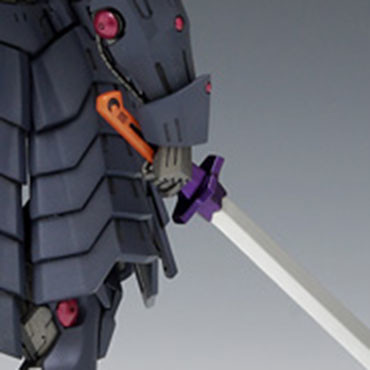
It is indeed purple in the line art but it is unnoticeable when zoomed out, it would appear dark gray.
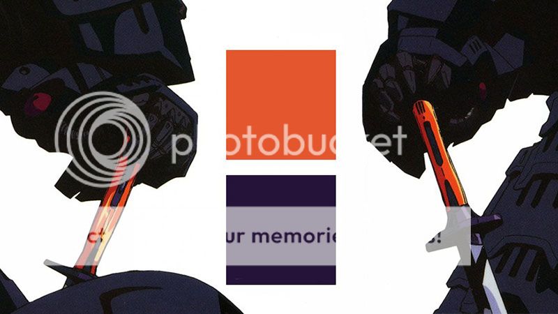
So I want a purple that is not as catchy as wave, appear dark grey when you are not looking at it directly.
I have Eva 01 night purple, may darken it a little, have to test it first.
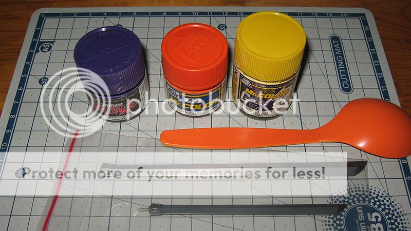
I'll keep the bare finish of the metal paint, without gloss coat. It would appear blurt most of the time when blades are coated.
From Barber's WIP.
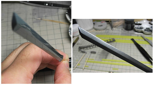
I repainted the blades with just SM Iron.
Now it looks like the line art with a metal color that looks white on highlight.
Tested some purple, I'll be using the one in red brackets. May do some masking and start with the orange later today.
Here is a 1 hour long video of the process.
https://www.youtube.com/watch?v=BdJ2OBkDbbI