The black, looks too purple and black at the same time, I tested it on an optional armor part, I hated it, the surface details were so hidden under its semi-gloss finish, I added quite a bit of white to lighten it, it's only a bit lighter but the difference is quite huge. Yet under my room's lighting, you would still look at it and say it is a type of black. The amount of purple in it is now very subtle I guess, at a first glance it would appear just grey, after looking at it for a while the purple starts to show a little, maybe too little now?! I reckon it is better to have it subtle than overdone.
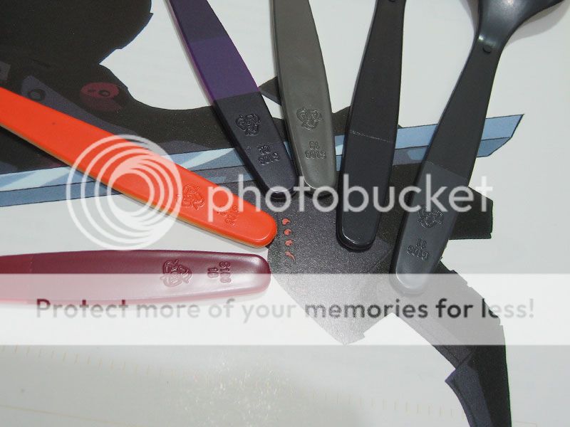
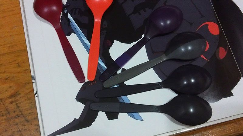
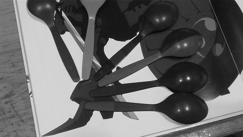
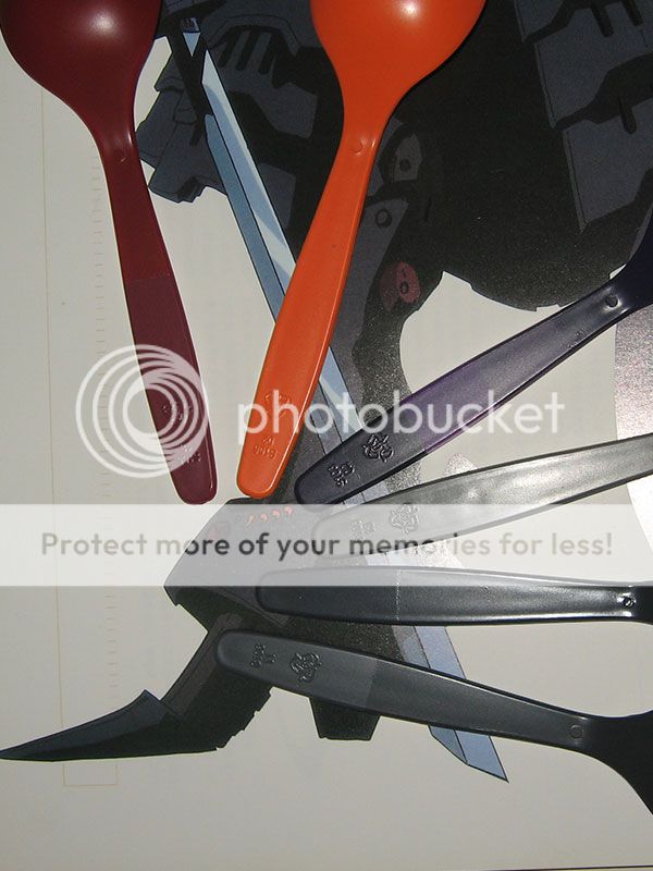
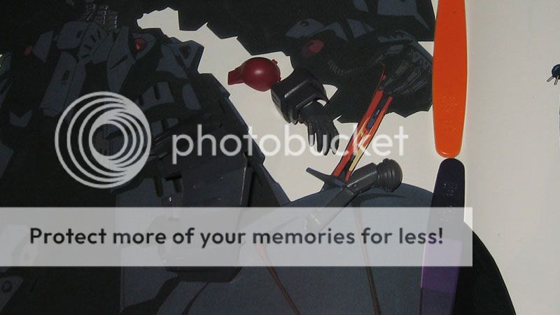
Clock-wise from the red, I masked off the spoons to paint only the tip, so you see the the difference with the old mixes.
The scan from the Designs 3 has a lot of contrast an brightness in it. I also referenced to the Knight Flags.
The red is more dark and desaturated, but since there are some highlight of red on the forehead and chest in the line art, I did some adjustment and this is the color I think it is supposed to be according to the image in my head.
I can't find a way to desaturate orange, it would turn green for some reason, so I only added a bit more Gundam Yellow.
Purple for the sword handle isn't changed.
I added about 30% of brown to the light grey for the under armor, the patterns on the underside are rectangles so I thought a brown-ish gray would revok the padding under armors。
The color in the line art supposedly shown how it would look under sunlight, I used the lower part of the page for reference which is darker. My color is even a bit darker than that, and less blue。
The frame gray has been lighten by a lot, to have more contrast with the main color(my black is darker, and my frame is lighter compared to the drawing)。I hated how it had a little green and blue so I added just a bit of brown。
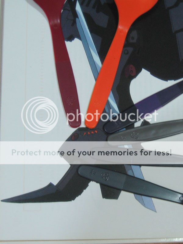
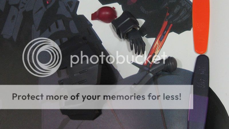
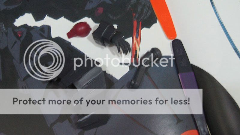
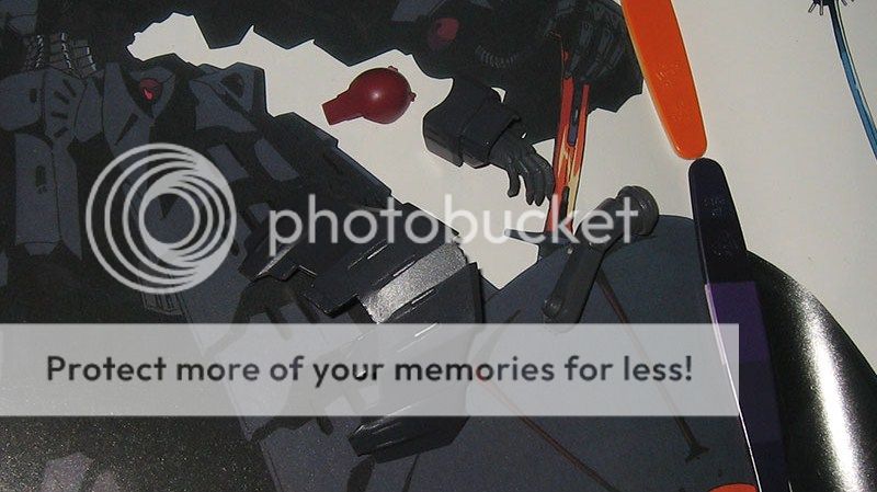
I tested it on the optional parts, I should prep these part as well, they will come in handy in the future builds. Now they looked ugly due to them being not sanded.
No comments:
Post a Comment